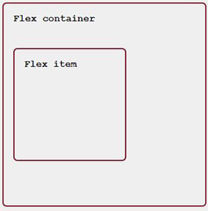
Do you want to learn CSS flexbox in 10 minutes? This article aims to give you a one stop shop for all your flexbox needs. During the research undertaken for this article, it turns out that the same questions pop up time and time again. I have taken the time to answer them all here.
Bookmark this page for your own css flexbox cheat sheet - let’s get into it.
1. How to center items
For the next few examples, imagine this html:
<div class="flex-container">
    <div class="box-1">
        <!- content ->
    </div>
</div>
Vertical centering
To center flex items vertically, use the align-items property.
.flex-container {
    display: flex;
    align-items: center;
    /*
        align-items works on the vertical axis
        */
}
Result:
Horizontal centering
To center flex items horizontally, use the justify-content property.
.flex-container {
    display: flex;
    justify-content: center;
    /*
        justify-center works on the
        horizontal axis
        */
}
Result:

Horizontal & vertical centering
To center items both horizontally and vertically, use align-items with justify-content
.flex-container {
    display: flex;
    align-items: center;
    justify-content: center;
}
Result:

2. How to put even horizontal space between items
To align content to the left and right of a container is made easy with css flexbox and justify-content: space-between; A good example of when this may come in handy is in a header of a webpage.
Let's start with this HTML:
<div class="flex-container">
    <div class="logo">
        <span>Logo</span>
    </div>
    <nav>
        <ul>
            <li>Home</li>
            <li>About</li>
        </ul>
    </nav>
</div>
By setting the flex-container as display: flex; and adding justify-content: space-between; the logo and the nav will be aligned to the left and the right of the container respectively.
.flex-container {
    display: flex;
    justify-content: space-between;
}
Result:

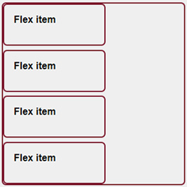
3. How to evenly space elements vertically
To achieve even spacing of elements vertically, we can use two flex properties in conjunction with one another.
Let's say we have a few flex items and these need to be vertically stacked and evenly spaced. Take this HTML:
<div class="flex-container">
    <div class="box"></div>
    <div class="box"></div>
    <div class="box"></div>
    <div class="box"></div>
</div>
Let's start by stacking each box vertically. We can do this with flex-direction: column; This sets the container to have a vertical main axis - stacking each item.
.flex-container {
    display: flex;
    flex-direction: column;
}
We can use the justify-content property to space the flex-items. By default, this property would be used to space elements horizontally, but as we have used flex-direction: column;, it will now control vertical spacing of elements.
We have 3 choices of how we can space the flex items. Let's take a look.
space-around
The first option is to use justify-content: space-around; This places items with space distributed evenly around the start and end of the list.
.flex-container {
    display: flex;
    flex-direction: column;
    justify-content: space-around;
}
The image below shows this in action.

space-between
justify-content: space-between; evenly distributes space between the elements with the first item set at the start of the container and the last item is set at the end.
.flex-container {
    display: flex;
    flex-direction: column;
    justify-content: space-between;
}
Result:
space-evenly
justify-content: space-evenly; spaces items such that they have equal amounts of space before and after them.
.flex-container {
    display: flex;
    flex-direction: column;
    justify-content: space-evenly;
}
Result:

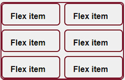
4. How to use the gap property
The CSS gap property allows you to explicitly set the distance between each flex-item within a flex container.
The difference between using margin as opposed to gap is the spacing will only apply to the distance between each item and not around the whole element.
.flex-container {
    display: flex;
    flex-wrap: wrap;
    gap: 8px;
}
See how the flex items now have an 8px gap between them but there is no spacing around the elements.
5. Position the last item at the end of a container
Here, we can simply use margin-left: auto; or margin-right: auto; to align one flex item at the end of a container.

6. How to re-order content with the order property
Flexbox has an order property that we can use this to re-order content in such a way that differs from the structure of the HTML. This can be very useful when creating responsive elements that may have a layout shift when going from one screen size to another.
Although, this has a catch. Re-ordering content this way affects accessibility and people accessing your web page using a screen reader. Keep this in mind when using the order property.
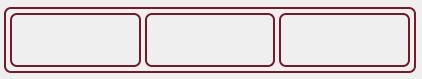
Take this code:
<div class="flex-container">
    <div class="box box-1"></div>
    <div class="box box-2"></div>
    <div class="box box-3"></div>
</div>
.flex-container {
    display: flex;
    padding: 4px;
    gap: 4px;
}

.box {
    width: 100px;
    height: 100px;
    border: 2px solid #991933;;
    border-radius: 7px;
}
Output:
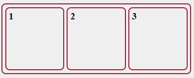
Now if we give each flex item an order value, we can re-order these items using CSS. See the code below:
.box-1 {
    order: 1;
}

.box-2 {
    order: 2;
}
This gives us:
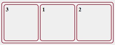
Notice how .box-3 is now the first in order. This is because by default flex items have a default order propery of order: 0;.
7. The difference between inline-flex and flex
Applying both flex and inline-flex make all children of the container flex items and all css flexbox rules then apply to the children.
The difference is to the container itself. Applying display: flex to a container will make it act like a block element in respect that it will take up its own row in the layout. Whereas applying display: inline-flex will make that container act the same as an inline element and will share a row with other inline elements.
8. How to center a flex container and directionally align flex items
To center a container we can wrap it in it's own flex container and use justify-content: center;. Let's see this in action:
<div class="box-container">
    <div class="box">
        <p>This is some content</p>
        <p>This is more content</p>
        <p>This is some more content</p>
    </div>
</div>
.box-container {
    display: flex;
    justify-content: center;
    width: 300px;
}

.box {
    width: 200px;
}

Aligning the flex-items
We can now use the same justify-content on .box to align the containing content. We also need to set flex-wrap: wrap; so that the content will wrap to a new line.
.box {
    display: flex;
    flex-wrap: wrap;
    justify-content: flex-end;
    width: 200px;
}
Result:

9. How to prevent flex items from stretching
By default a flex item will stretch and fill the remaining space within its container. We can override this behaviour by setting align-self: flex-start; on the item. An example:
<div class="flex-container">
    <div class="box box-1"></div>
    <div class="box box-2"></div>
</div>
.flex-container {
    display: flex;
}

.box-2 {
    align-self: flex-start;
}

10. The difference between flex-basis and width
At a first glance, there may not be much difference between width and flex-basis, but diving deeper can give a better understanding of the differences.
The first point to make here is that flex-basis will only work on flex items whereas width will work on non-flex items too.
Secondly, when working with flex-basis, we need to take the flex-direction property into account. If we have a container that has flex-direction: column; then flex-basis will work on a vertical axis as opposed to the horizontal axis. In this case width would be needed.
Thirdly, flex-basis has no affect on position: absolute; elements, again width would be needed here.
Lastly, it is worth noting here that flex-items by default have a property of flex-shrink: 1; and this allows those items to shrink. Therefore, setting width: 200px; or flex-basis: 200px; does not necessarily mean that the element will be 200px wide, if it is allowed to shrink in the container, it will. To lock a flex-item at a set width we would need to set flex-shrink: 0;
11. flex-grow and flex-shrink
For both examples in this section, let's use this HTML:
<div class="flex-container">
    <div class="flex-item">
        <p>flex-item</p>
    </div>
    <div class="flex-item">
        <p>flex-item box-2</p>
    </div>
    <div class="flex-item">
        <p>flex-item</p>
    </div>
</div>
flex-grow
The flex-grow property is used to define the ability for a flex item to grow if needed. It takes a unitless value.
.flex-container {
    display: flex;
    gap: 4px;
    padding: 4px;
}

.flex-item {
    flex-grow: 1;
}
Setting flex-grow: 1; will mean that all of the .flex-item divs will take up the same amount of space, as shown below:
However, if we set .box-2 to have flex-grow: 2; - we would be telling .box-2 to take up twice as much space the other divs. See below:
.box-2 {
    flex-grow: 2;
}
flex-shrink
flex-shrink allows you to set by how much an item will shrink compared to its fellow flex items when there is not enough space in the container. Let's see an example using the code from our previous example, but with this CSS:
.box-2 {
    flex-shrink: 2;
}
The CSS above tells .box-2 to shrink twice as much as the other flex-items when there is not enough screen space.
12. The flex shorthand
There is a shorthand that combines the properties flex-grow, flex-shrink and flex-basis. The shorthand can take one, two or three values.
The default property settings are flex-grow: 0;, flex-shrink: 1 and flex-basis: auto;
flex-grow: 0; would mean that the flex item is not flexible and would stay at the content size if there is excess space.
flex-shrink: 1; would mean that the item would shrink with the window down to it's minimum size.
flex-basis: auto; sets the item to the same width as it's content.
Setting flex with one value
.flex-item {
    flex: 1;
}
This is equivalent to flex-grow: 1;, flex-shrink: 1; and flex-basis: 0;
This means that the item will grow and shrink with the available space. If there are multiple flex items in a row with this setting then each will take up the same amount of proportional space.
Setting flex with two values
.flex-item {
    flex: 1 100%;
}
This is equivalent to flex-grow: 1;, flex-shrink: 1; and flex-basis: 100%;
.flex-item {
    flex: 1 2;
}
This is equivalent to flex-grow: 1;, flex-shrink: 2; and flex-basis: auto;
It is important to note that when setting flex with two values, the second value will be assigned to either flex-shrink or flex-basis based upon if the value is valid for that property.
For example flex-basis: 2; is not valid CSS and therefore this will be interpreted as flex-shrink: 2; and flex-basis will default to auto.
Setting flex with three values
.flex-item {
    flex: 1 1 100%;
}
Each property can be set independently when using 3 values as above.
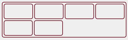
13. Aligning items in a row
CSS grid may be the optimal option for most to create multi-column layouts but that does not mean that you cannot do this with CSS flexbox.
For this example, we are going to align four elements per row. Excess elements will wrap onto a new line.
It is important to note that this example assumes that the document has box-sizing: border-box; set. You can read more about this here - Paul Irish: { Box-sizing: Border-box } FTW
Let's start with this HTML:
<div class="flex-container">
    <div class="flex-item">
        <p>flex-item</p>
    </div>
    <div class="flex-item">
        <p>flex-item</p>
    </div>
    <div class="flex-item">
        <p>flex-item</p>
    </div>
    <div class="flex-item">
        <p>flex-item</p>
    </div>
    <div class="flex-item">
        <p>flex-item</p>
    </div>
    <div class="flex-item">
        <p>flex-item</p>
    </div>
</div>
The CSS we will need to do this:
.flex-container {
    display: flex;
    flex-wrap: wrap;
    padding: 4px;
    gap: 4px;
}

.flex-item {
    flex: 1 calc(25% - 4px);
}
Here, we are setting the container to be display: flex; and flex-wrap: wrap;. This allows the excess elements to wrap.
flex: 1 calc(25% - 4px); - this tells each item to have flex-grow: 1;, flex-shrink: 1; and a flex-basis of 25% - 4px.
The last rule is the most important here, the 4px will be relative to all your padding and margin on a flex item combined. For example, if you had margin: 10px; and a padding: 10px on each item then you would set flex: 1 calc(25% - 20px).
The result:

If you want the wrapped elements to have the same width as the others then we can assign them a class of .no-grow or something similar and set the CSS for that class to:
.no-grow {
    flex-grow: 0;
}
New result: